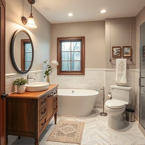


Color plays a pivotal role in cabinet design, shaping the mood and aesthetics of spaces. By understanding color psychology, designers can create harmonious or contrasting effects tailored to specific rooms. Warm tones stimulate energy for social areas like kitchens, while cool colors promote calmness for bedrooms or home offices. Aligning color choices with overall style—from rich tones for traditional to vibrant shades for modern—enhances the aesthetic appeal and psychological well-being of the space. Achieving visual harmony through color theory ensures beautiful, cohesive kitchen and bathroom renovations.
Discover the powerful impact of color on your cabinet design. This guide explores how psychology influences our perception, helping you choose hues that elevate your space. From classic to modern cabinets, we delve into harmonious combinations and clashing errors to avoid. Learn to balance aesthetics and function through clever color selection for a stunning, cohesive cabinet design. Enhance your kitchen or bathroom with these insights, transforming it from ordinary to extraordinary.
- Understanding Color Psychology in Cabinetry
- Choosing Colors for Different Cabinet Styles
- Creating Harmonies and Avoiding Clashes
Understanding Color Psychology in Cabinetry
Color plays a significant role in shaping the mood and perception of your cabinet design, making it an essential aspect to consider when creating a functional space that also exudes aesthetic appeal. In the realm of cabinetry, understanding color psychology can help designers and homeowners make informed choices that enhance the overall look and feel of a room, whether it’s a kitchen remodel or home additions.
Different colors evoke various emotional responses, which can be leveraged to create harmonious or contrasting effects. For instance, warm tones like red, orange, and yellow are known to stimulate energy and conversation, making them ideal choices for social areas such as kitchens, where you want to foster interaction and a vibrant atmosphere. On the other hand, cool colors like blue and green promote calmness and relaxation, suitable for bedrooms or home offices seeking a more serene ambiance. When incorporated into cabinet design, these color preferences can transform functional spaces into inviting environments that cater to the psychological well-being of occupants.
Choosing Colors for Different Cabinet Styles
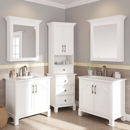
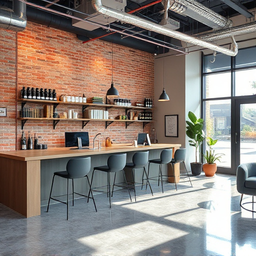
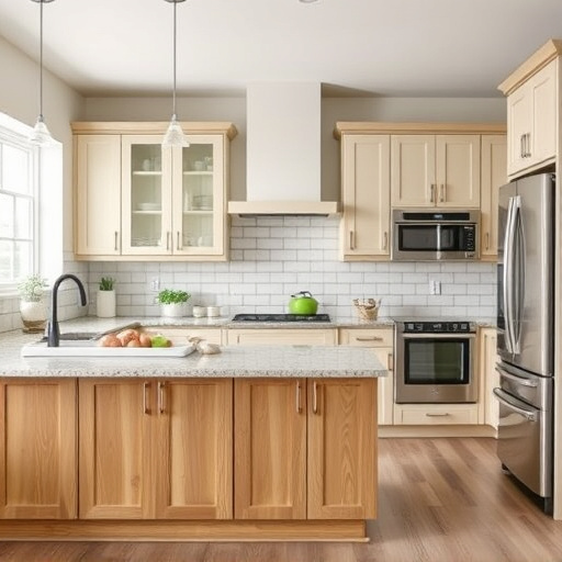
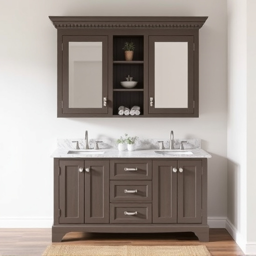
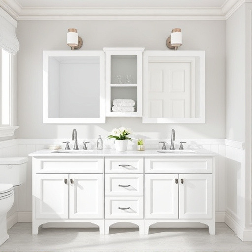
When considering colors for your cabinet design, it’s crucial to align the hue choices with the overall style. For instance, rich, deep tones can enhance the classic elegance of traditional or colonial-style cabinets, while brighter, more vibrant shades might better suit modern or contemporary designs. In a minimalist or Scandinavian-inspired kitchen, muted neutrals like beige or gray create a serene ambiance, whereas bolder colors like emerald green or burnt orange can add vibrancy to rustic or industrial cabinet styles.
Customized work and home remodeling projects often benefit from understanding these color dynamics. For customized home renovations, selecting the right palette can transform a space from ordinary to extraordinary. Whether you’re going for a subtle, harmonious look or a bold, striking statement, keeping your cabinet style in mind will ensure a cohesive design that elevates the beauty of your kitchen or bathroom.
Creating Harmonies and Avoiding Clashes
In cabinet design, creating visual harmonies is key to achieving a beautiful and cohesive look. Colors play a significant role in setting the mood and ambiance of your space. When selecting hues for your cabinets, consider how they interact with each other on the color wheel. Complementary colors enhance one another, while analogous shades create a harmonious blend. For example, pairing deep blues with soft teals or warm woods with earthy tones can result in a visually appealing cabinet design that feels inviting and balanced.
Avoiding color clashes is equally important for a successful kitchen or residential renovation. High-contrast colors may look striking but can make the space feel chaotic. Steer clear of combining bright reds with vibrant yellows, as these intense hues might overpower your senses. Instead, opt for more subtle combinations like gray with soft pastels or neutral tones with rich, deep colors. This approach ensures functional spaces that are both aesthetically pleasing and calming, enhancing the overall enjoyment of your kitchen renovations.
When designing your cabinet, consider that color psychology plays a significant role in shaping your space. By understanding how different hues impact perception and mood, you can create a harmonious cabinet design that enhances your kitchen or bathroom aesthetics. From classic to modern styles, choosing the right colors allows you to craft a visually appealing and functional cabinet that becomes the focal point of any room. Remember, creating balance through color harmony ensures your cabinet design not only looks stunning but also invites a sense of comfort and satisfaction.